1996: Flash and CSS Bring Design to the Web
There were two stylistically opposed approaches to web design in the 1990s, epitomized by two distinct — and utterly different — technologies, both of which debuted in 1996.
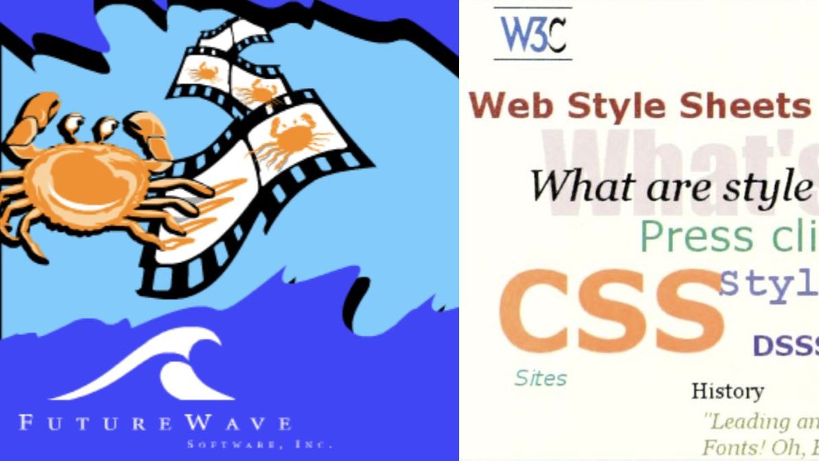
After the birth of web apps in 1993 with CGI scripts, followed by startups like Yahoo using Perl code to create dynamic websites in 1994, and then client-side interactivity arriving in 1995 with Netscape’s JavaScript, the web was evolving fast into a full-stack programming platform. During the same time period, there were experiments happening on the presentation side of the web; what eventually became known as web design.
Even though web programmers had their differences (JavaBeans or ActiveX?), web design in the 1990s became a much more deeply divided occupation. There were two stylistically opposed approaches to web design, epitomized by two distinct — and utterly different — technologies, both of which debuted in 1996.
The first, Cascading Style Sheets (CSS), represented structure. Design elements were to be encoded in a new language, CSS, as defined in a W3C web standards specification. The over-riding principle was separation of content and presentation, with content marked up in HTML and presentation in CSS.
At the other end of the web design spectrum was the animation tool Flash, in which presentation and content were mashed together in one file. Also unlike CSS, Flash was a proprietary tool owned by a single corporation: a company called Macromedia. In fact, Flash couldn’t have been more different from CSS — the software was not open source, the source file format (FLA) was proprietary, and the output did not conform to web standards.
But Flash had a few important things going for it. Firstly, the tool was easy to learn (unlike CSS). Secondly, it could do much more, visually, than CSS. Almost anything was possible using Flash, with the only constraint being the bandwidth limitations of the time. Thirdly, and most crucially — at least for the first several years — Flash didn’t rely on the leading browser companies implementing it. The Flash player was a browser plug-in, so all it needed was for users to download that plug-in. Which they did, en masse.
CSS and Flash had similar goals in 1996. Both aimed to expand the state of web design on the web during the mid-to-late 1990s. Yet only one of them led to an explosion of visual creativity on the web…and it wasn’t the open web standard. If you wanted to create a killer website in the 1990s, Flash was the tool that many web designers of that time reached for.
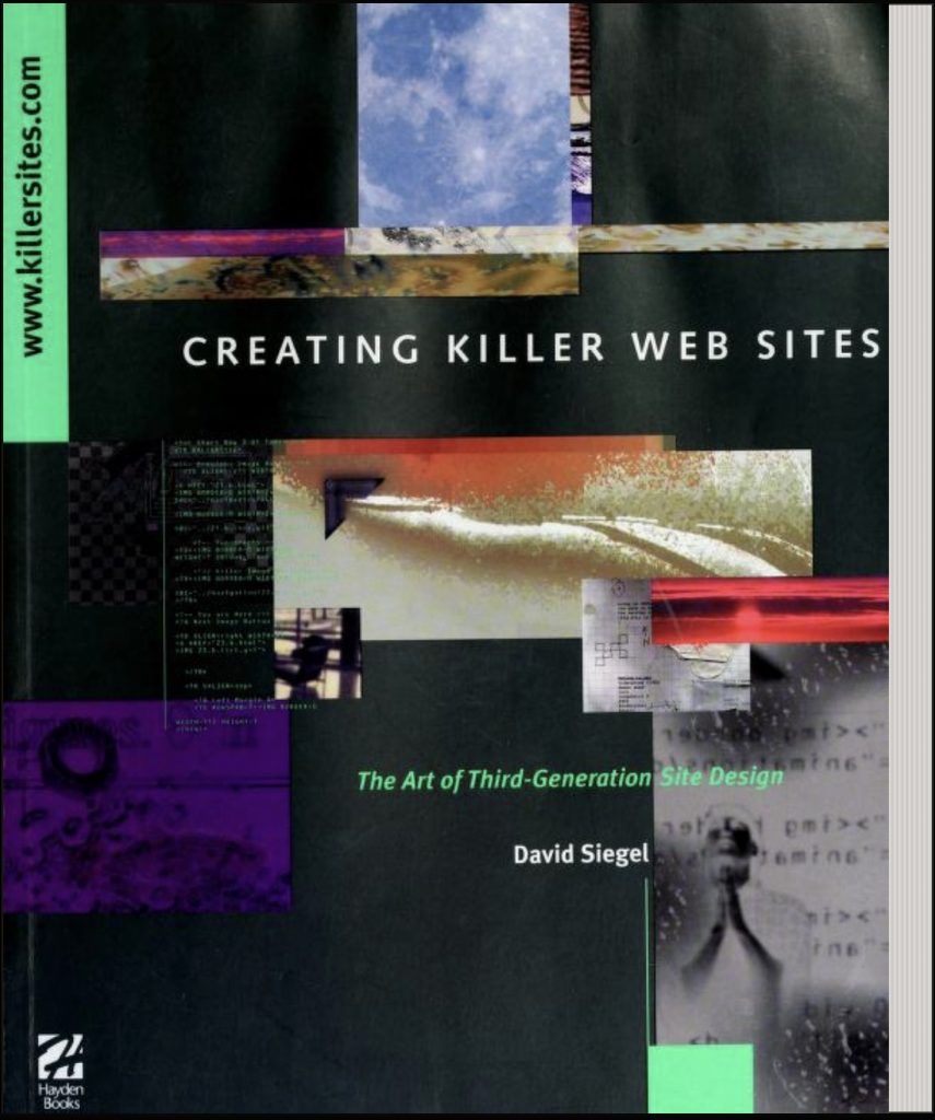
Aside: I used the term “killer website” deliberately, as an homage to an influential web design book from 1996 (that I myself bought), David Siegel’s Creating Killer Web Sites: The Art of Third-Generation Site Design. The first edition of this book came out before CSS or Flash. It advocated for “hacks” to HTML, such as table-based layouts, in order to make websites more visually appealing. It had a chapter entitled “A PDF Primer,” but did not mention CSS (as the final spec hadn’t yet been released). The second edition, published in 1997, replaced the PDF primer with a new chapter: “A CSS Primer.” That’s how fast web design changed after 1996!
Flash: Low-End Multimedia For the Masses
Flash has a long and involved business backstory, but we’re going to skip all that. From a web development perspective, the real history starts in August 1996 when a company called FutureWave Software released an animation tool called FutureSplash Animator. It was described as “a 2D animation product for the World Wide Web” that enabled users “to create vector-based drawings and buttons and then animate them.”
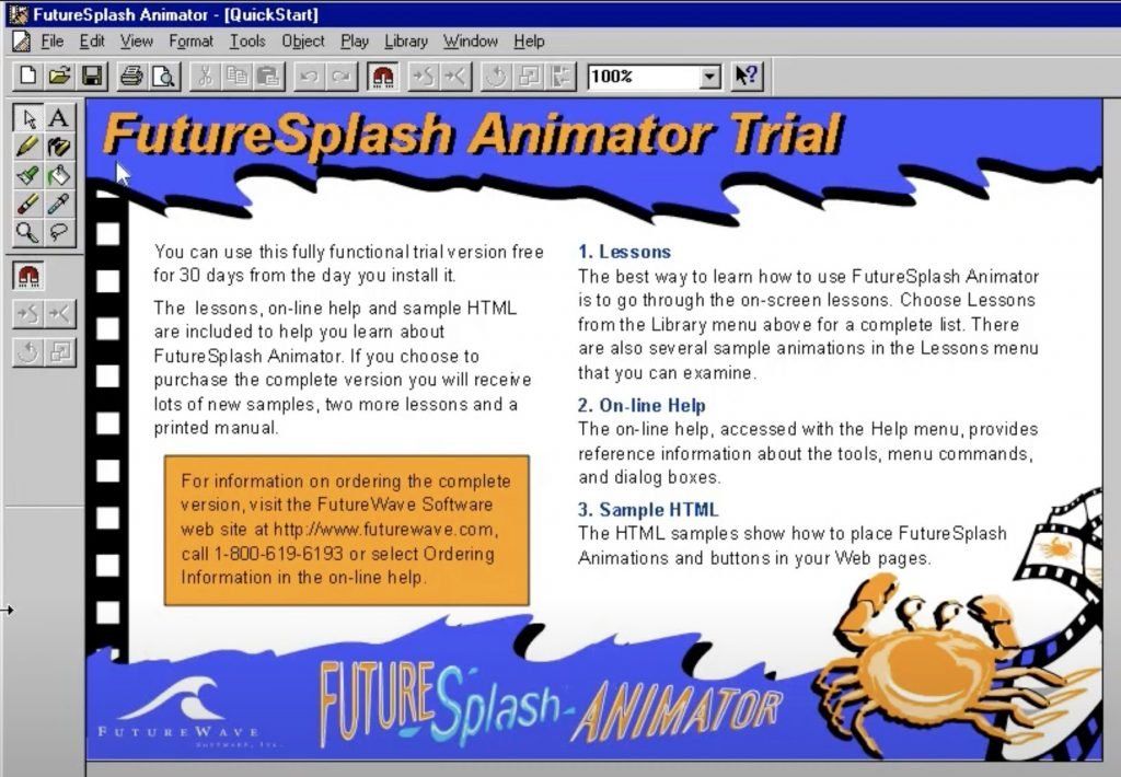
Most significantly, the drawings and animations could be embedded into HTML web pages with the company’s Java-based plug-in, FutureSplash Player. The player was made available on both leading browsers of the time, “as a Netscape Navigator plug-in and a control for Microsoft’s InternetExplorer 3.0 ActiveX.” So right from the start, the product that became Flash was two separate pieces of software: the animation tool for web designers, and the player (a browser plug-in) that end users would view the animation in.
The chief developer of Animator was Jonathan Gay, a talented programmer who had previously developed computer games and also the 1992 graphics software program, Aldus IntelliDraw. But it was Animator that won him acclaim, and he would eventually go on to become Chief Technology Officer of Macromedia.
After its release, FutureSplash was fortunate to get early takeup by prominent websites like Microsoft’s MSN and The Simpsons. In November 1996, the FutureSplash website announced that the official Simpsons website had been built using Animator and that the site had just gone “on-line”. The Web Design Museum captured a video to show how it worked.
This is when Macromedia came sniffing around. At the time, Macromedia was known as the main rival of Adobe in the fast-developing internet “multimedia” market. It had started out in 1992 in the CD-ROM business, but pivoted to the web in the mid-90s. Director was its flagship authoring product and in 1995 Macromedia launched a web multimedia player to complement it, called Shockwave. It was released in June 1995 as a plug-in for Netscape Navigator 2.0.
Macromedia acquired FutureWave in December 1996. In the CNET writeup of the acquisition, FutureWave Animator was described as a “low-end multimedia authoring tool” — with Director being the “high-end” one. The report also noted the name change, to Macromedia Flash, adding that “the plug-in will be incorporated into the company’s family of Shockwave players.” In a Wired report, a Macromedia executive noted that “Flash is attractive to Macromedia because the files it generates are small and can be scaled across different modem speeds.”
In hindsight, we can see why a “low-end” multimedia tool like Flash gained traction in the years to come — it was the ease-of-use and relative low cost ($249 after Macromedia bought it) for web designers, and the speed and responsiveness in the browser for the end user.

CSS: High Expectations for Structure
Far away from the glamorous world of multimedia, Tim Berners-Lee and his CERN office-mate Håkon Wium Lie were working on a way to separate presentation from content. The goal was to create a “style sheet language” that would move styling code out of the HTML code. But this wasn’t a new idea. Indeed, it was a part of Berners-Lee’s original conception of the World Wide Web, as explained in a later W3C article:
“Tim Berners-Lee wrote his NeXT browser/editor in such a way that he could determine the style with a simple style sheet. However, he didn’t publish the syntax for the style sheets, considering it a matter for each browser to decide how to best display pages to its users.”
The motivation for CSS, then, was to enable web authors to control the layout of their websites — just as Berners-Lee had done in 1990 — rather than let browser vendors dictate presentation. With that in mind, in October 1994 Lie wrote a proposal for “Cascading HTML style sheets”:
“This document proposes a style sheet scheme for HTML documents. The proposed scheme provides a simple mapping between HTML elements and presentation hints. Properties like font family and window size can be suggested by the style sheet, and it can also provide logic to make presentation decisions based on the user’s environment; e.g. the size of the screen or the current date.”
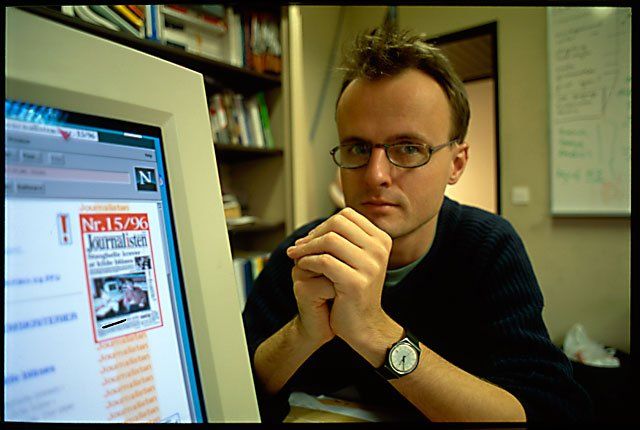
The real innovation though was the “cascading” part, which meant that multiple style sheets could be used — each one for a specific context. So there would be an ordered list (a cascade) of style sheets. In his proposal, Lie tried to strike a balance between the web author’s need to control layout and the need of readers to feel somewhat in control too:
“While the author (or publisher) often wants to give the documents a distinct look and feel, the user will set preferences to make all documents appear more similar. Designing a style sheet notation that fill both groups’ needs is a challenge.”
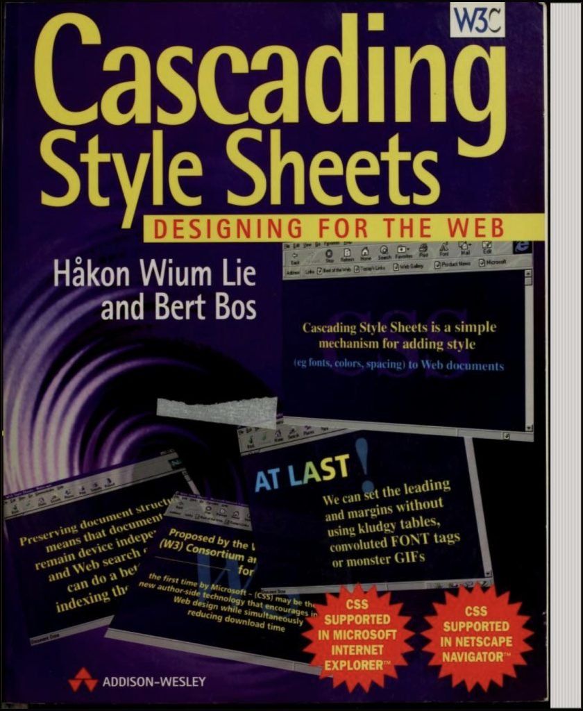
Lie went on to author the CSS specification along with Bert Bos, and “level 1” of this spec was published in December 1996. The definition of “cascade” had benefited from a couple of years of iteration, with the balance of power tipped back in the web designer’s favor. The stated goal in level 1 was that “authors can attach a preferred style sheet, while the reader may have a personal style sheet to adjust for human or technological handicaps.”
Flash Won…Until It Didn’t
Ironically, for all of Berners-Lee and Lie’s talk about wanting web designers to be in control of layout, the browser vendors stymied that for several years after 1996 by not fully supporting CSS (or by supporting it in divergent ways). That led many web designers directly into the arms of Macromedia Flash, where full control over layout was guaranteed. Also, millions of web users added the Flash plug-in after 1996, in both Netscape and Internet Explorer. It became one of the essential plug-ins of that era, because so many cool websites were being made with Flash.
Web designers also took longer than anticipated to get behind the structural goals of CSS. Lie later commented in an interview that a key motivation for creating CSS was to support the web’s underlying structure:
“…we wanted to preserve good mark-up. HTML has tags. A lot of people started to use images instead of tags because they wanted to control typography. Instead of writing a headline, they put the headline into an image. This is bad for many reasons: It takes more space, it’s not accessible to blind people, etc.”
Unintentionally, Lie had just explained the appeal of Flash to early web designers — it was effectively a giant animated image file that gave designers total control over what was displayed on a user’s browser screen. It was the opposite of “good mark-up,” but designers and users alike did not care. Flash in a browser was colorful, engaging and fun. It reminded everyone of the internet’s predecessor in mass entertainment: television. Especially tv shows that had cultural cachet in that era, like MTV.
Flash videos in the 90s turned out to be a forerunner of YouTube’s popularity in later years. Indeed, for the first decade of YouTube’s existence, 2005-2015, Flash was its default player. Until, finally, markup — in the form of HTML5 and CSS — took control.
The fall from grace of Flash in the 2010s was as fast as its rise in the mid-90s. By 2009, Flash was said to be installed on 99% of internet-connected desktop PCs. But it failed to adapt to the rising smartphone era — famously, it was banished from iPhones in an open letter by Steve Jobs in 2010. After that letter, Flash creator Jonathan Gay did an interview in which he impetuously derided Apple’s decision:
“Apple wants to displace Flash’s role in video delivery on the Web with the H.264 standard and Apple wants developers to build custom applications for the iPhone and not cross platform applications. Both of these goals support Apple’s business goals driving their closed iPhone application platform but are destructive to openness on the web.”
While Gay wasn’t wrong to say that Apple was steering iPhone developers towards its own closed platform, instead of the web, he failed to appreciate that Flash was arguably doing equal damage to the open web. Flash content was unsemantic and was holding back web standards like HTML5 and CSS. That it got away with this for nearly fifteen years is, in retrospect, remarkable.
Nevertheless, we can also look back fondly on the undoubted visual flair of websites in the 1990s, that was almost entirely due to Flash. Fans of the open web are all glad Flash is gone now, but it isn’t forgotten.
Read next: 1997: JavaScript Grows Up and Developers Push the Boundaries
Buy the Book
My Web 2.0 memoir, Bubble Blog: From Outsider to Insider in Silicon Valley's Web 2.0 Revolution, is now available to purchase:
- Paperback, US$19.99: Amazon; Bookshop.org
- eBook, US$9.99: Amazon Kindle Store; Apple Books; Google Play
Or search for "Bubble Blog MacManus" on your local online bookstore.