ReadWriteWeb’s Big Redesign & the Inaugural Crunchies
At the end of 2007, ReadWriteWeb unveils our new design — featuring a slash of vibrant red in the header! Also, we co-host the first Crunchies in San Francisco and I meet Mashable’s founder.
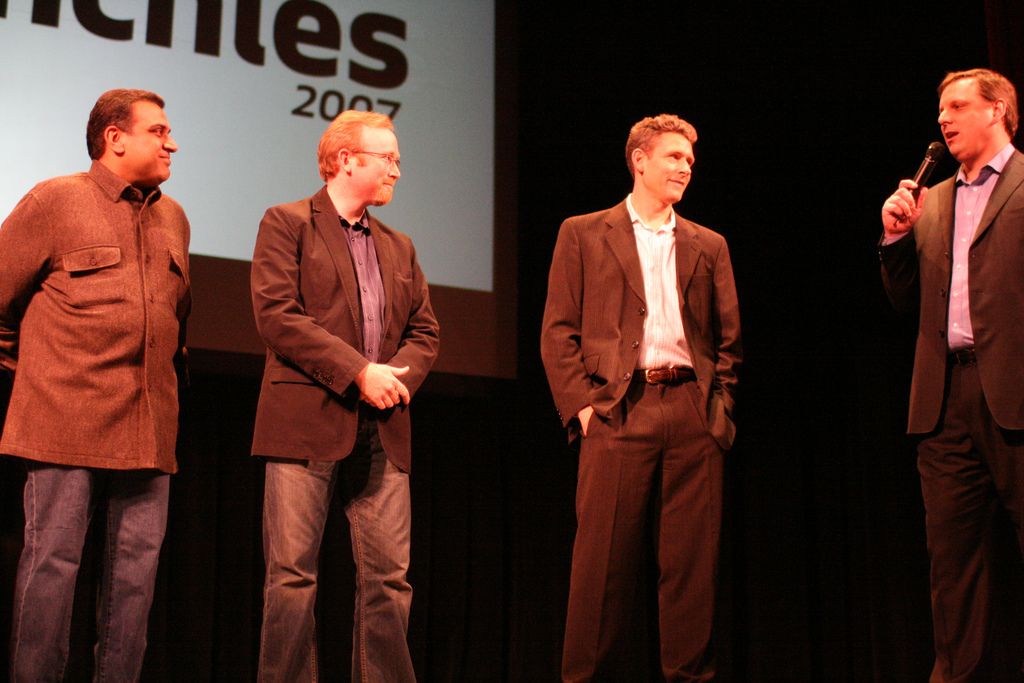
In early November 2007 Mike Arrington and his TechCrunch CEO Heather Harde approached me about participating in a new awards competition they’d come up with, “the Crunchies.” The idea (as far as I could tell) was to replicate the Webby Awards, which had been running since 1996. The Crunchies would focus specifically on Web 2.0 companies. TechCrunch would produce the show, with Read/WriteWeb, GigaOm, and VentureBeat as cohosts.
The night of the Crunchies was Friday, January 18, and the ceremony was held at the Herbst Theatre, an old-style auditorium in the Civic Center of San Francisco. My wife and daughter had joined me on this trip, so I took them into the greenroom before the show started. Om was very friendly, but everyone else—including Mike—seemed standoffish, no doubt due to busyness and nerves. I guided my family to their seats in the upstairs section of the hall and made my way backstage.
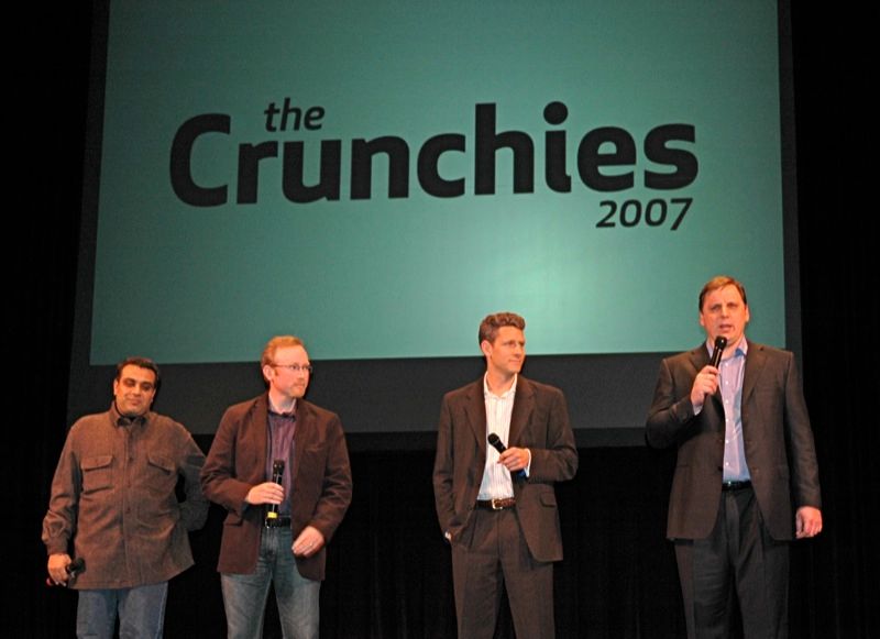
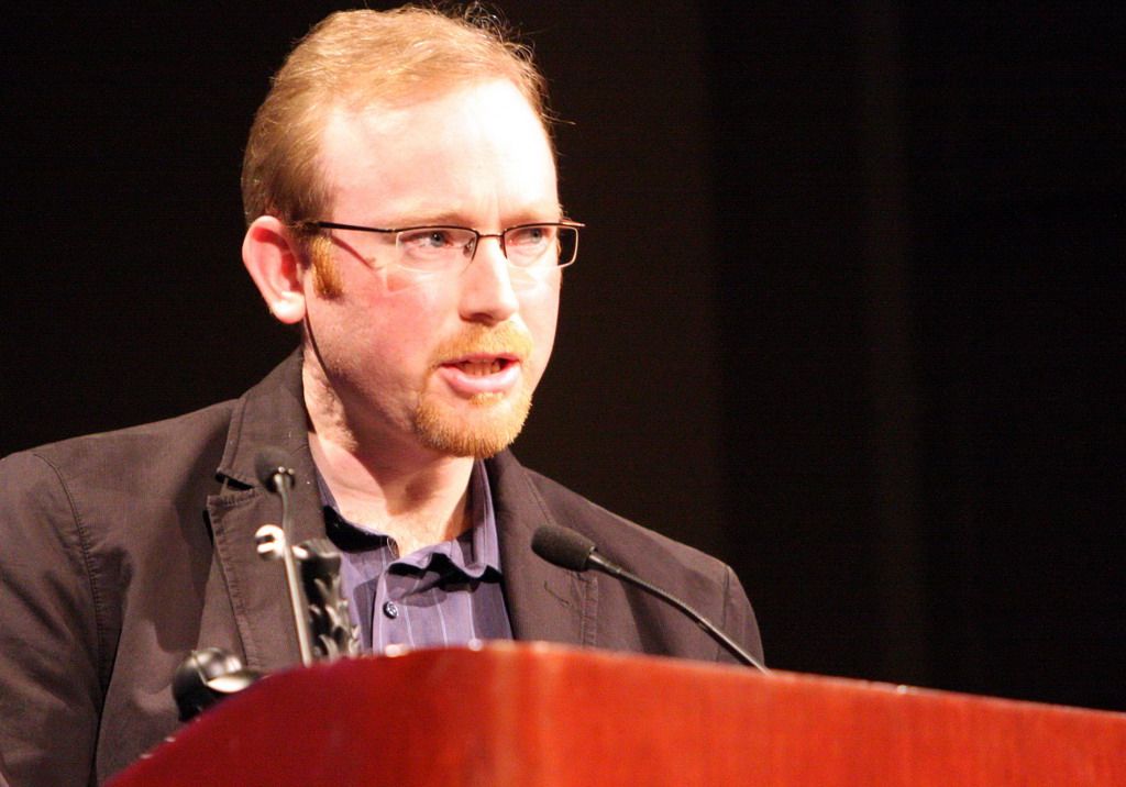
I was presenting two categories: Best International Startup and Best Design. I had written short notes in my little red notebook for each. For the best international startup award, I said that the award “has special significance for me, as the only non-US blog hosting these awards.” It went to Netvibes, the French start-page product that had become the trendiest in that category. I presented the award to Tariq Krim, its tall and handsome CEO. The best design award went to SmugMug, a photo-sharing website (which would eventually buy Flickr a decade later).
I wasn’t yet used to being onstage, so I was nerve-racked when speaking and my face was conspicuously red from anxiety. I felt more comfortable when all four of the main bloggers were onstage together. Mike was a confident speaker, and he and Om had a good repartee on stage. Matt Marshall, the founder of VentureBeat, was a reserved man like me, but he looked the part in his business suit and white button-down shirt.
There was an awkward moment backstage when it was discovered that RWW had published the full list of winners at 7:30 p.m., when the event had started. But this was because Heather had sent out the winners list earlier in the day to all four blogs, giving an embargo time of 7:30 p.m. Turns out I had missed a follow-up email later in the day by Eric Eldon at VentureBeat: “Talked with Mike about the embargo time. Please don’t post before the awards start!” So our post went out, as originally instructed, when the show started. I thought nothing of it at the time, but Mike was angry at me backstage when he found out. I was just confused; I hadn’t seen Eric’s follow-up, so my only response was that I was given an embargo time and had complied with that.
Later, back at my hotel, I saw Eric’s email and wrote back to everyone—my face now even redder than it was onstage. Erick Schonfeld, TechCrunch’s lead blogger, replied and admitted it was their fault. Mike wrote back too and apologized for “tearing into you at the event.” To be honest, I was so nerve-ridden during the show that I didn’t recall being upset at whatever Mike had said.
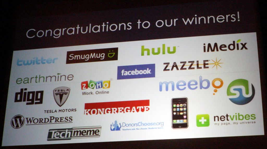
I hadn’t stayed for the Crunchies after-party, as it was late for my daughter. Truth be told, I was tired too. There were certain luminaries at the Crunchies that I didn’t get to meet—Mark Zuckerberg was there (he won best startup founder, and Facebook won best overall), as were the Twitter founders (best mobile startup). In fact, I hadn’t gotten the chance to speak with many people at all. So my feelings after the show were more of emptiness than elation.
The one person I do remember meeting that night, funnily enough, was Mashable’s Pete Cashmore. He’d been in the foyer before the show, having bought himself a Crunchies ticket. We exchanged brief greetings, but then Mike spotted him and told him to leave. Mashable was competing fiercely with TechCrunch at this time, and its rise up the Technorati chart over 2007 had ruffled many blogger feathers—including mine. I thought Pete had somehow juiced Mashable’s statistics, and I’d even lodged an “official complaint” with Feedburner’s founders about it. Regardless, the competition between TechCrunch and Mashable had become almost ludicrous. Just a week before the Crunchies, Mashable held its own awards ceremony in San Francisco, the Open Web Awards, which cunningly implied that its community was everyone but the Crunchies participants.
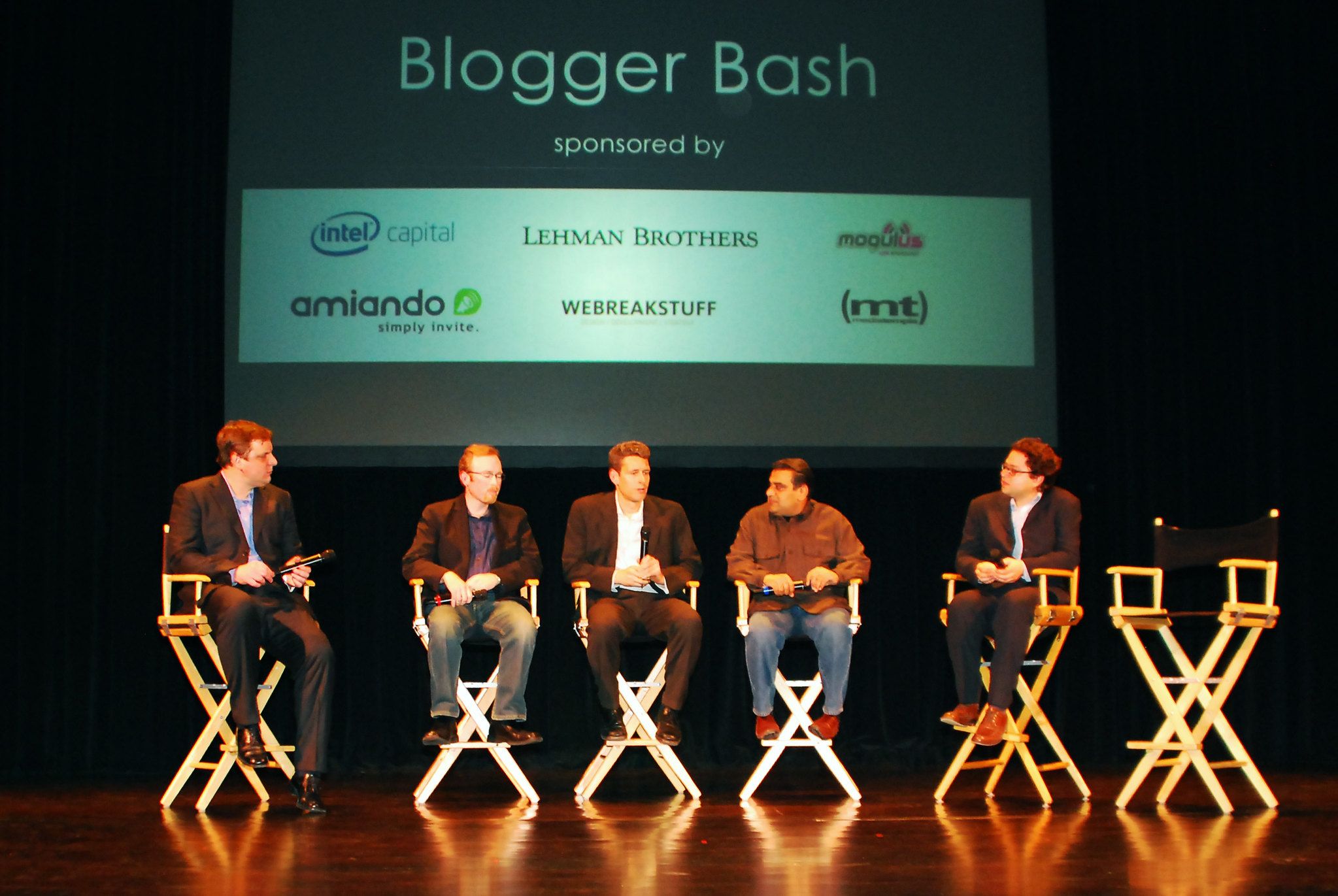
By this point I had begun to ignore the rivalry, reasoning that it wasn’t my battle. That said, one of my goals for RWW was to break into the Technorati Top 10. There was room enough there for all three of us, since RWW occupied a different space than the more news-driven TechCrunch and Mashable. In my notebook, I wrote that I wanted RWW to be “The Economist of web tech blogs.”
Despite the dueling awards shows, Pete had reached out to me by email suggesting that we meet up while we were both in San Francisco. He wanted to talk through whatever differences we had. I’d agreed, as I figured that we had more things in common than not as international outsiders. Also, I was curious to meet him in person—as far as I knew, this was his first business trip to the United States. His industry nickname was the Loch Ness Blogger because he was from Scotland and hadn’t been spotted in Silicon Valley before.
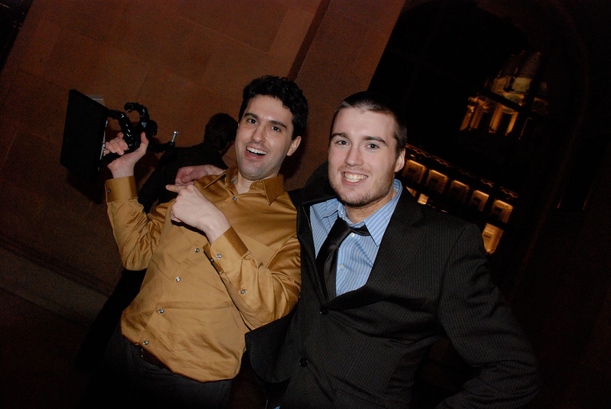
I met Pete the night after the Crunchies, at the Borders bookstore café on Post Street. He was wearing a suit that seemed a little too big for his tall, thin frame. He was twenty-two and had closely cropped dark brown hair, with a light smattering of stubble on his face. It was the same look that footballer David Beckham was sporting at the time (he’d recently come over to play for the Los Angeles Galaxy). That probably wasn’t a coincidence, I realized, because Pete was almost as handsome as Beckham—albeit with the sunken eyes and skinny frame of someone who spent too much time in front of a computer screen.
I had imagined the Loch Ness Blogger would be shy and awkward, but he turned out to be an overly caffeinated chatterbox. We talked about our shared interest in moving to Silicon Valley. I was thirty-six years old and married, with a school-age child, so there were many practical issues I’d have to sort through to make that move. But Pete was a twenty-two-year-old single man and seemingly had little to stop him. So I advised him to do it.
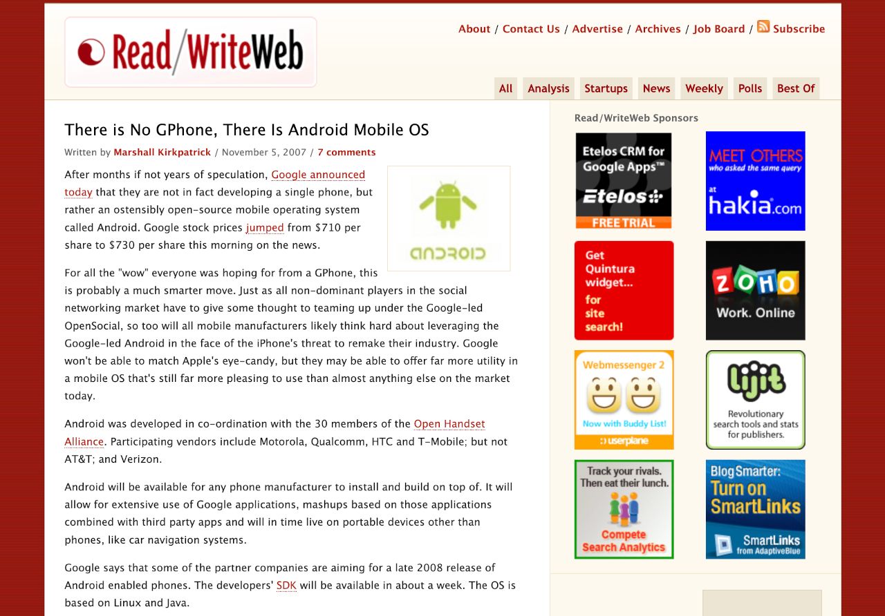
Silicon Valley was still a mecca for anyone who wanted to make it big in the tech industry. And sure enough, a few months after I’d met Pete in Borders, he emailed to say that he’d taken my advice and shifted to San Francisco. What neither of us fully realized was that the insider world of Silicon Valley was beginning to constrict around a set of five leading Web 2.0 companies. Apple’s iPhone was the talk of the town by the end of 2007, and in November Google had announced its competitor: an open-source mobile operating system called Android. Amazon had just announced its Kindle product, so it too was branching out into consumer devices, in addition to being the early leader in cloud computing. Meanwhile, Google Reader was now the dominant RSS reader and Facebook had all the momentum in social networking. Microsoft was perhaps the odd one out, since it was struggling to adapt to Web 2.0 with its awkwardly branded Windows Live project. But Microsoft still had dominant positions in PC, office, and browser software—which gave it the time and money to correct course.
While it would take another year or so to shake out, these five companies would soon be calling the shots in a few core Web 2.0 markets: social networking, smartphone apps, and cloud computing. It was the beginning of something new in the internet age—an oligopoly of companies exerting platform power. While small startups would, of course, continue to burst onto the scene in the coming years, often they did so knowing they’d have to compete for attention on the platforms of one of these big-five companies.
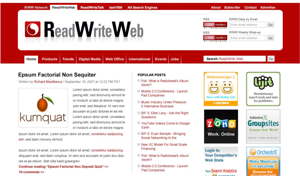
The end of 2007 also marked the end of an era for Read/WriteWeb. In December I announced our new design, which would become the iconic RWW look—lasting right up until I left the business nearly five years later. The new design immediately gave us a unique and modern identity in the tech blogosphere. The first thing that caught your eye was a plush red banner running across the top of the page, indicating the header area. Inside this banner were the logo, the site and network menus, the subscription buttons (RSS and email), and the search bar. The rest of the page was now entirely white, rather than the deep red-and-cream combo of the previous design.
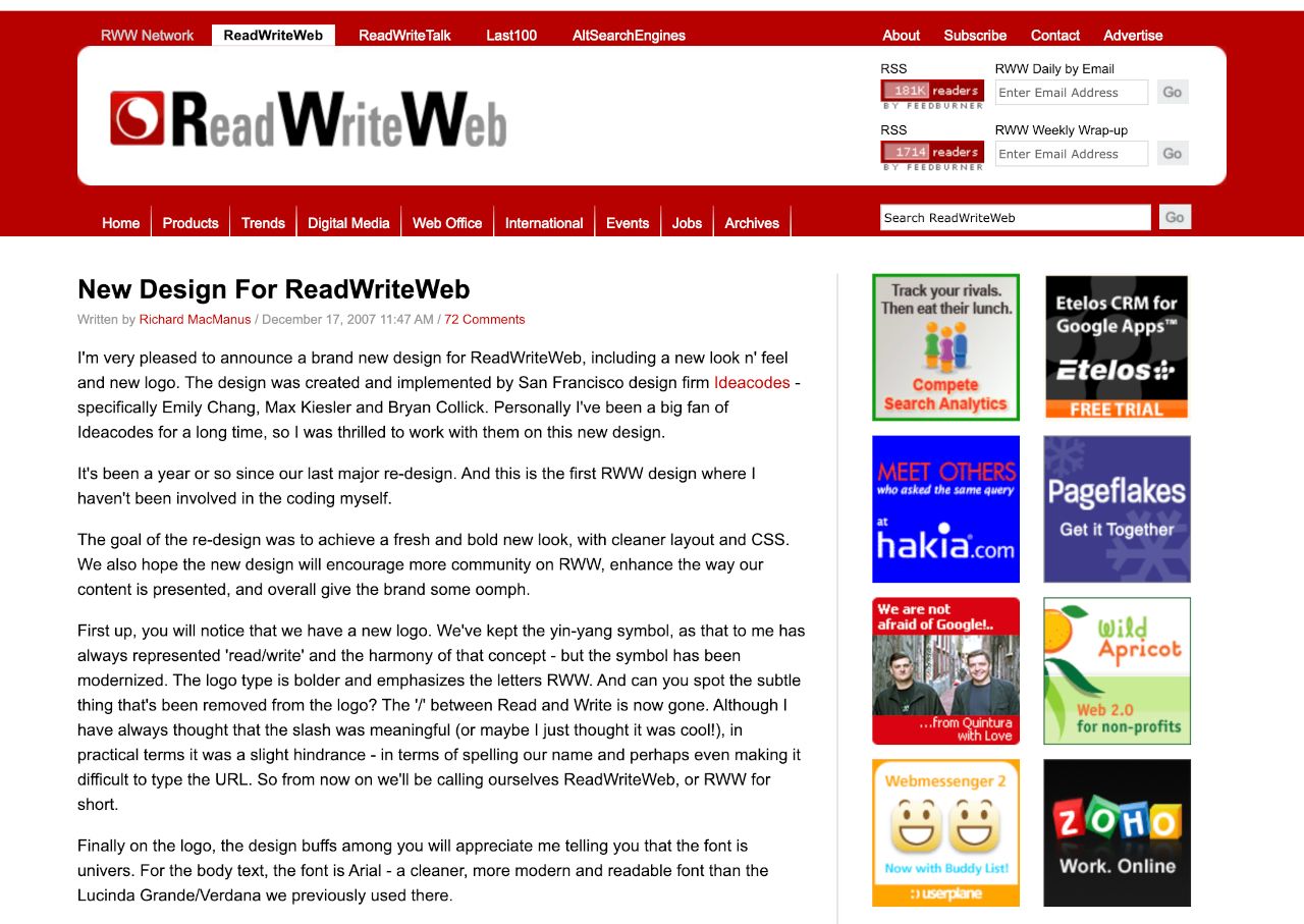
I was blown away by that single slash of vibrant red in the header—it stood out like a beacon on the crisp white background. Overall, this design was much roomier and less boxy than its predecessor. The logo was much improved as well. We’d finally gotten rid of the ‘/’ in the brand name, so it was now ReadWriteWeb instead of Read/WriteWeb. The R, W, and W were now emphasized in black type, while the rest of the letters were in an attractive silver; my Twitter handle was @RWW, and that acronym was now widely used as the shorthand to refer to our site—so it was nice to highlight that in the logo design. The yin-yang symbol had also been given a Web 2.0 makeover; it was now encased in a red box with rounded corners (everything had rounded corners in Web 2.0).
The redesign also added new sections to the home page, which would help drive traffic. There was now a Popular Posts list next to the lead story, a Featured Posts section directly below, and a Recent Comments section below that. There were other improvements, too, such as a new set of main categories.
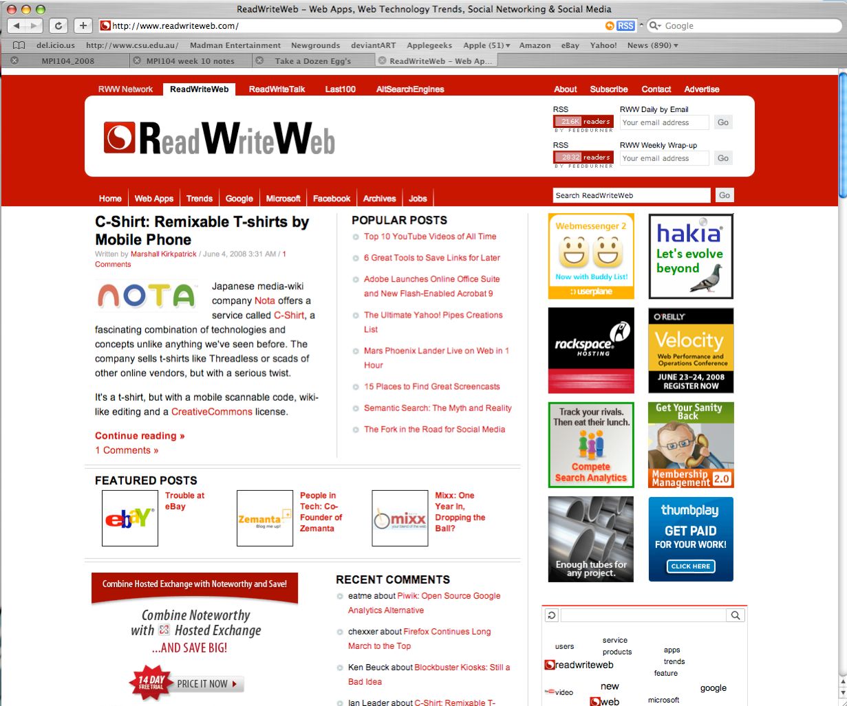
Overall, I loved what Ideacodes, the designers, had done—it had certainly met my goals for a “fresh and bold” new look for RWW. In the launch post, I noted that “this is the first RWW design where I haven’t been involved in the coding myself.” It was yet more evidence that I needed expert help if I was to continue scaling RWW.
Feedback in the comments section, however, was mixed. I was surprised that many people didn’t seem to like the new logo. Some of this was justified, as on closer inspection it had a few technical glitches—the two capital Ws were not properly aligned, for example. Once I’d run it past some designer friends, I asked Emily and Max to do the necessary fixes.
While some of the criticism was constructive, we also got some nonsensical comments, like “I know the previous color palette was red but this seems bolder and red means stop to many of us.” Hmmm, tell that to The Economist, or CNN, or Manchester United! I took the time to vigorously defend the new design in the comments, but honestly, I didn’t care what other people thought. To me, it was fresh and distinctive. From this point on, RWW would always be—in my mind’s eye—a website with this particular design and logo.
The same commenter who claimed that red means stop also said that the yin-yang symbol was “really trite.” Some of our current and future RWW writers would’ve agreed with him—Marshall, for instance, was never shy in expressing his disdain for it. But this was one thing I would never change my mind on. Yin-yang had always signified to me the equal importance of the read and write functionalities of the web—the internet was for creation just as much as consumption. The concept of harmony was also important to me on a personal level; later I would explore it more by taking tai chi classes and reading up on the philosophy of Taoism.
Of course, the technical implementation of the design did not go as smoothly as I’d wanted. There were many bugs to sort through, and even a week after launch, a bunch of these bugs were still unresolved.
To make matters worse, at the end of December our site experienced outages once again. As usual, I tried to get answers from our web hosts and Six Apart. Media Temple’s solution was to upsell me to more expensive hardware, while Six Apart demanded that RWW start paying for their assistance. My frustration levels were boiling over. I would have to come up with a better way to manage the technical platform in 2008.
Despite the continuing site management strain, RWW was in a great place heading into the new year. We’d exceeded one million page views for the first time in December 2007, and we were growing strongly month over month. We’d risen to number 18 in the Technorati list of the world’s most popular blogs, and our Feedburner RSS subscriber widget had now ticked over 200,000. As we entered the new year, I was feeling very positive about where RWW was headed.
Lead image: The Crunchies, co-hosted by (from left to right) GigaOm, ReadWriteWeb, VentureBeat, and TechCrunch; photo by Garrett Gee.
This post is part of my serialized book, Bubble Blog: From Outsider to Insider in Silicon Valley's Web 2.0 Revolution. View table of contents.
Next up: 027. Acquisition Talks: Two Suitors For ReadWriteWeb
Buy the Book
My Web 2.0 memoir, Bubble Blog: From Outsider to Insider in Silicon Valley's Web 2.0 Revolution, is now available to purchase:
- Paperback, US$19.99: Amazon; Bookshop.org
- eBook, US$9.99: Amazon Kindle Store; Apple Books; Google Play
Or search for "Bubble Blog MacManus" on your local online bookstore.